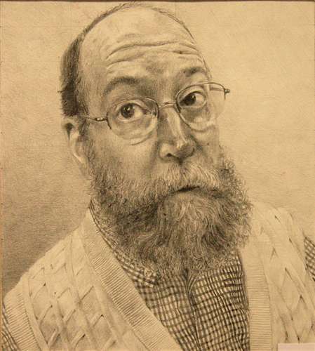
On our field trip to the Third Ward and the Milwaukee Institute of Art and Design, I was able to see so many inspiring objects and pieces of art. It was so nice to be able to walk around and admire all the things that I find so intriguing to my eye and things I think could help my artwork grow.
 One of the images I captured from MIAD really interested
me was this one, with the yellow and blue paint. The colors
really contrast and I like the way the artists used an expressionistic approach to painting the face with blotches to create the facial shapes. You can tell it's a face, but you can't make out the exact features and I think it creates somewhat of a mystery for the viewers.

This image of the cow I thought was actually quite cute. I liked how the cow had a stick figure body, yet the head was rendered and and the background was rendered to appear realistic as well. I think that the artist was trying to say something about our perception of cows or maybe how things can still be simple, yet complex. Overall it was one of my favorite pieces at MIAD.
 This painting was actually one of the first ones I saw at MIAD. It was a huge canvas with really realistic rendering. The animal cookies looked so real, they made us all hungry when we walked by! I liked the way the artist put so much paint on the canvas to render. The paint was really thick and helped contribute to the texture of the cookies and I think the gold, metallic background really brought out the colors and detail put into the cookies.
 This sculpture was in the Kate Gingrass Gallery and I found it really humorous because it was a cat lady -- literally, a woman made out of cats. And the detail put into the cats and the woman were just impressive and so realistic.
 This picture of the street in the Third Ward was just really cool. I thought it'd be interesting to get the destruction of the road surrounded by the beauty of the buildings of the third ward. I actually think I might use this scene for my cityscape in our next project.
 This was from the store, Anthropology. It's a sculpture of books used as almost a headboard for the bedding on display. I think it was really intriguing with the colors of the books and the way they were staggered. I found it really inspiring because of the way the sculpture filled the space and caught my eye.
 One of the images I captured from MIAD really interested
 me was this one, with the yellow and blue paint. The colors
really contrast and I like the way the artists used an expressionistic approach to painting the face with blotches to create the facial shapes. You can tell it's a face, but you can't make out the exact features and I think it creates somewhat of a mystery for the viewers.

This image of the cow I thought was actually quite cute. I liked how the cow had a stick figure body, yet the head was rendered and and the background was rendered to appear realistic as well. I think that the artist was trying to say something about our perception of cows or maybe how things can still be simple, yet complex. Overall it was one of my favorite pieces at MIAD.


 This picture of the street in the Third Ward was just really cool. I thought it'd be interesting to get the destruction of the road surrounded by the beauty of the buildings of the third ward. I actually think I might use this scene for my cityscape in our next project.
 This was from the store, Anthropology. It's a sculpture of books used as almost a headboard for the bedding on display. I think it was really intriguing with the colors of the books and the way they were staggered. I found it really inspiring because of the way the sculpture filled the space and caught my eye.